Storycorps is a national project that instructs and inspires people to record each others' stories through sound and animation.
www.storycorps.org
duration: Designed in 2016 in one month; still live.
Role: UX/UI Design, Hi-Fidelity WIREFRAMES, Visual Design, Information architecture
AGENCY: Webinhabit
TYPE: responsive website
OBJECTIVE
StoryCorps approached us with a proposition to completely overhaul their current website with their new visual identity. We have been listening to their weekly stories on NPR for years and we were excited to deliver something streamlined and easy to use.
THE PROBLEM
Almost all users complained they couldn’t find what they were looking for via the older site’s search options or filtering system. Even though the client’s site housed an archive of literally thousands of emotionally empowering interviews and stories, they were inaccessible to their enthusiastic user-base.
PROCESS
Since we had a very short window of less than a month to complete this project, we started with an initial discovery meeting with StoryCorps so that they could voice their needs and we could get a better understanding of the current problems they were facing. This meeting included the Marketing Director, the Digital Technology Director, as well as the Webinhabit CEO and myself as design leads.
In our meeting they voiced the need to bring more emotion to the site while also imploring the need to simplify the design and keeping it flexible on the backend. There was also a need to bring the audio player to the forefront since that is a major focal point of the site as well as the mission of StoryCorps.
RESEARCH + DISCOVERY
We began to do some competitive research with focus on sites that had similar features to StoryCorps; showcasing podcasts, news, and donations. We then began to group overarching themes that resonated with the team with specific focus on the Homepage, Visuals, and Organization of content.
Big images on the landing page that show emotion
Simplifying navigation
Create a safe space for users to feel present with the content
Incorporating the new branding
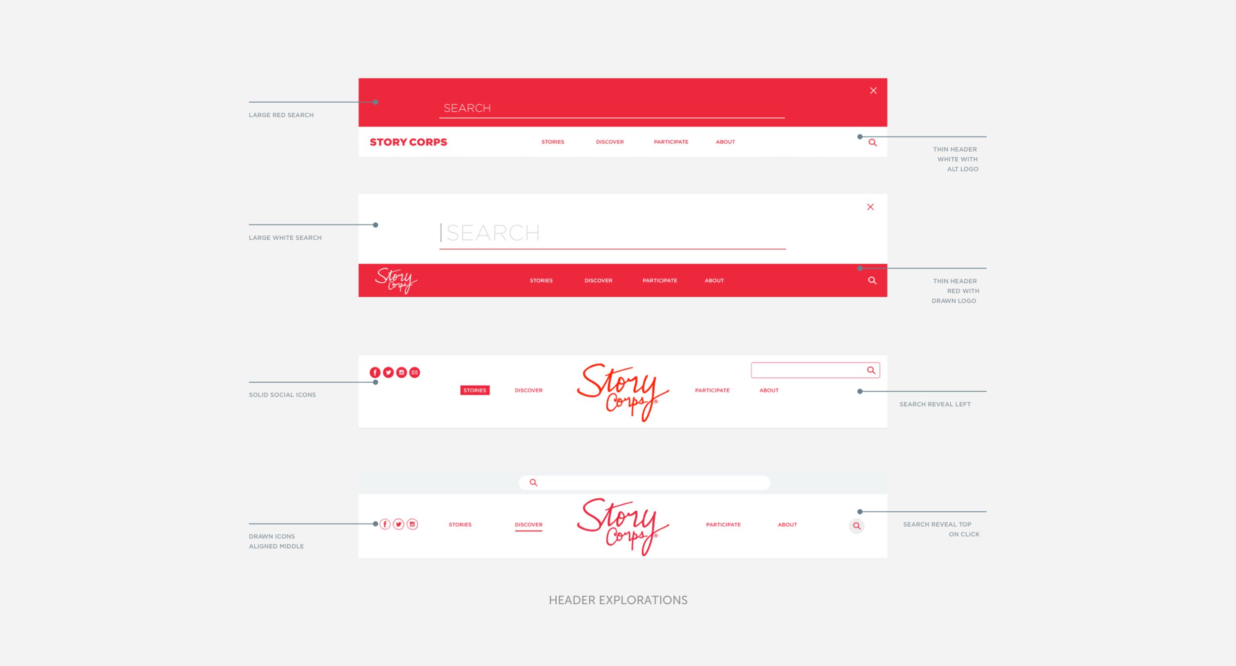
HEADERS & SEARCH
We decided to tackle this with mini sprints. First we began with the top nav and search functionality. The old site had a mega menu with several drop downs for the sections Listen, Watch, Record, and Connect and StoryCorps wanted to move away from the super complicated navigation to something more refined.
We wanted the search to be at the forefront, something unique and omnipresent so that you can always search from the beginning. Instead of jumping into wireframes, I jumped straight into hi-fidelity designs that incorporated the brand colors so that we could start to develop in tandem and stay on schedule as soon as elements were signed off on.
MODULAR CONTENT
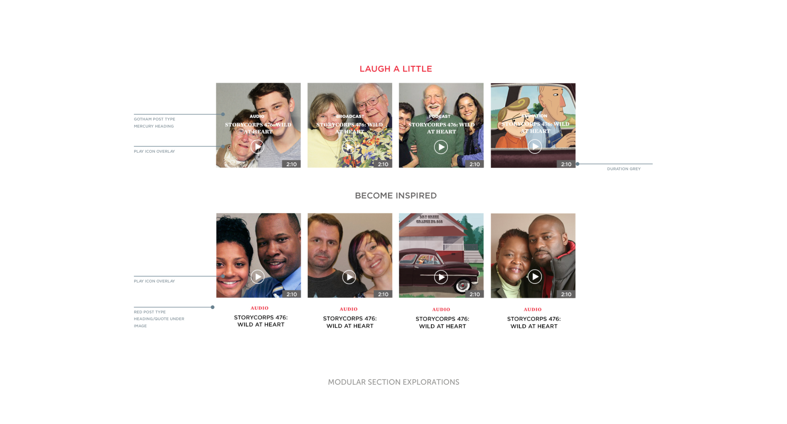
The next sprint consisted of the various modules that would be featured on the site. We continued with quick iterations that were slightly varied. There was the obvious “related listening” and “featured today” vs something a little more personalized like “laugh a little” or “become inspired.” By creating this type of modular content, it would make it easier to create different layouts.
I also created different types of modules for their podcasts as well as donations that could placed on the page as a breaking point after every 8 stories. For stories that were longer or had more pictures, they would break the text into smaller pieces and for additional audio, a clip would be added.
We landed on a four column option and two column that could be interchanged throughout the site. We kept the site minimal and incorporated as much negative space as possible. The addition of the duration of the audio clips also became important, listeners would know how much time they would be investing in each clip before playing.
THE SOLUTION
A layout that was more open and modular, while incorporating a streamlined tagging system that categorized all of the user stories and animations. Each individual story had additional tags on the interior to help each listener flow through the content more seamlessly.


